
You’re not alone if you are having trouble choosing colors for your interior. This article will help you to make a decision on a color scheme. You may find yourself spending hours scrolling through Pinterest. It’s time to think about the 60-30-10 rule. Let’s walk you through a design formula to give your home an harmonious look. This is how you can incorporate the 60-30-10 Rule into everything from wall art to furniture. Let’s get started!
Interior Design Color Wheel: Detailed Explanation
Consider the colors that you would like to include in your palette before we begin. The classic color wheel is a great way to find your perfect color scheme. Colors that are opposite each other on the wheel can be used to add contrast in your home. Consider using colors that are next to one another for a monochromatic look. The color wheel is useful for choosing accent colors, even if you start with a 60 percent neutral color scheme.
Wall decor allows you to experiment with colors without committing too much. You can change your wall art at any time. You can also experiment with colors before you commit to a palette by painting sample swatches onto your wall. This will help you visualize the color scheme.
Interior Color Trends
Trending colors can also be used to help you choose the perfect color scheme for your home. After the pandemic, post-pandemic design trends emphasize bold colors. Accent colors like yellow, teal, periwinkle and periwinkle will brighten up your space. Create an organic base using natural tones such as sage, olive and other cool, muted colors. If you want to know the best colors for creating a modern interior, the top design hubs predicted them. After you’ve chosen a few colors, it’s now time to learn about how to balance the color scheme.
What is the 60-30-10 rule?
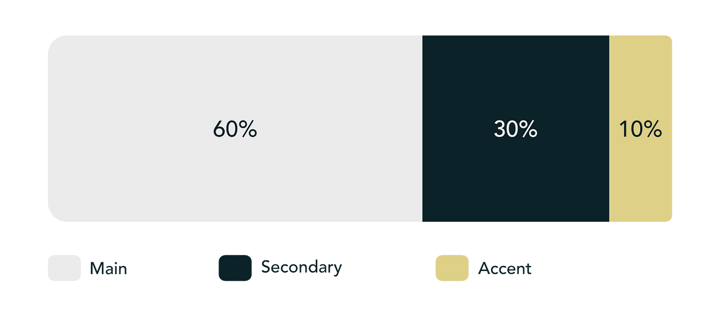
The 60-30-10 rule is a simple way to choose the right color scheme for you home. The most important part of any home’s decor is the color scheme. You can experiment with a rainbow of colors, from bright and bold to neutral and subtle. According to this decorating rule, you should use 60% of the dominant color in your room, 30% of secondary colors, and 10% accent shades. The key is to maintain the perfect balance between colors. Choose colors that blend well together to create subtle combinations. Choose colors that work well together.
Create a Gorgeous Color Palette
Dominant Color
Fill your room 60% with the dominant color. The dominant color should be applied to the main objects of the room. The walls are the first thing you notice when entering a new room. The color that you select as your 60% shade will also be the wall color.
Secondary Colour
Consider the secondary color to be the supporting character in your room. Your home’s stylish appearance is influenced by the linens, curtains, area rug, side chairs and cushion sets in your couch. These elements are great choices for the shade of 30%. You want the color to blend well with your dominant color. Combining colors together should give an overall blended look.
Accent Color
The 10% remaining of the decor formula is an accent color that compliments the dominant shade and the secondary shade. This role is usually played by accessories and decor. Candles on your dining table, a pendant lamp in your bedroom or a small rug for the study are all examples of accenting a room using the 10% shade.
Artwork is another way to incorporate 10% of the formula. Let your wall art bring balance and contrast to the room while the walls are dominant. You can, for example, use this butterfly orchid wall art to make the colors pop off the wall.
The 60-30-10 Decorating Rule: Best rooms for it
The 60-30-10 rule can be applied to any room of your house. This technique is best used in areas that are heavily trafficked. Prioritize the areas that are most frequently visited by guests. A balanced color scheme would be beneficial in your dining room or entryway, for example.
The 60-30-10 Rule in Living Rooms
Living room is the most social space in your house. In your main living area, a 60-30-10 palette is a great choice. Choose three colors that are both representative of you and also appealing to a broad audience. You need to strike a balance between choosing unique colors that stand out and creating a comfortable, cozy space. You can add accent colors to your living room with wall art. This statement color gives you more freedom.
Inspirational 60-30-10 Ideas
A popular color combination today is 60% white (walls, rugs, sofas), 30% brown wood (wooden furniture, hardwood floors, accent lounge chairs with leather), and 10% of green plants (small or large). Yoko Chow is an Interior Designer at Yoko Chow Design LLC in CA.
This can be supported scientifically by biophilia, the human’s natural affinity with nature. The study reflects on the psychological and physiological effects of different ratios and concluded that a moderate ratio of natural materials (45%) is the most effective. This ratio is dominated by wood, which we use in interiors because it’s the most sensible natural material. It can be combined with leather upholstery, straws baskets, greenery and other materials. This option is popular with the masses because of its tranquil, natural appeal.
The Bold Combination
“A bolder choice that is perfect for homeowners who are looking to create a sophisticated atmosphere is 60% shades greige (walls, cabinets, floors), 30% black (countertops and lighting fixtures, chairs and appliances), and 10% gold (hardware, such as chair legs and handles, outlet covers and decor).” Yoko explains.
Dare to Be Creative
Consider a monochrome style instead of choosing different colors. Choose shades of the exact same color for your dominant, secondary and accent tones. The use of different shades of the exact same color creates a smooth flow and a subtle and stylish look in your room.
You can also do the opposite! Decorate your home with black and a splash accent color to create a refined look.
Still stuck? Start with your favorite colour. Love pastels? You can create a cheerful, fresh room with a 60-30-10 pastel combination. Red is your favorite color? Use rusty shades of red with whites and oranges to create a vibrant room. There are many options.
The Rules Are Meant to Be Broken
Do not be afraid to experiment and adapt the 60-30-10 to suit your unique style. Instead of using 30%, you could use 15% + 15% to create a more personalized look. Be careful to choose colors that are harmonious. Your room should be a harmonious blend of shades and not a jumble of colors.
The 60-30-10 Rule in Unique Ways
This rule can be applied in unique ways that go beyond just painting colors and furniture. The 60 30 10 rule can be used to guide the placement of textures and patterns in a room. You could, for example, use a large pattern to cover 60% of the room. This might be a wallpapered wall accent or a bold rug. The next 30% of the room could be dedicated for smaller, complementary patterns such as window treatments or throw pillows. The remaining 10% can be used to add texture with a faux fur throw, metallic accent, or plush faux-fur throw. Applying the 60-30-10 rule to textures and patterns, you can create an layered space with a wide range of design elements and still maintain a consistent color scheme.
The Color Theory of Interior Design: A Brief Summary
The 60-30-10 rule can be a useful tool for anyone, whether they are a professional interior designer or DIY novices. It will help you choose a color scheme that is balanced and harmonious. You don’t need a calculator to create a unique and fresh home decor.